Celebrating a decade of iconic music photography from Loud And Quiet
- Text by Sam Warner
- Photography by The Horrors by Pavla Kopecna

Stuart Stubbs began Loud And Quiet in January 2005 to write passionately and insightfully about the music he loved. Over the years, it has grown from a fanzine to a free music magazine with a strong reputation on the independent publishing scene.
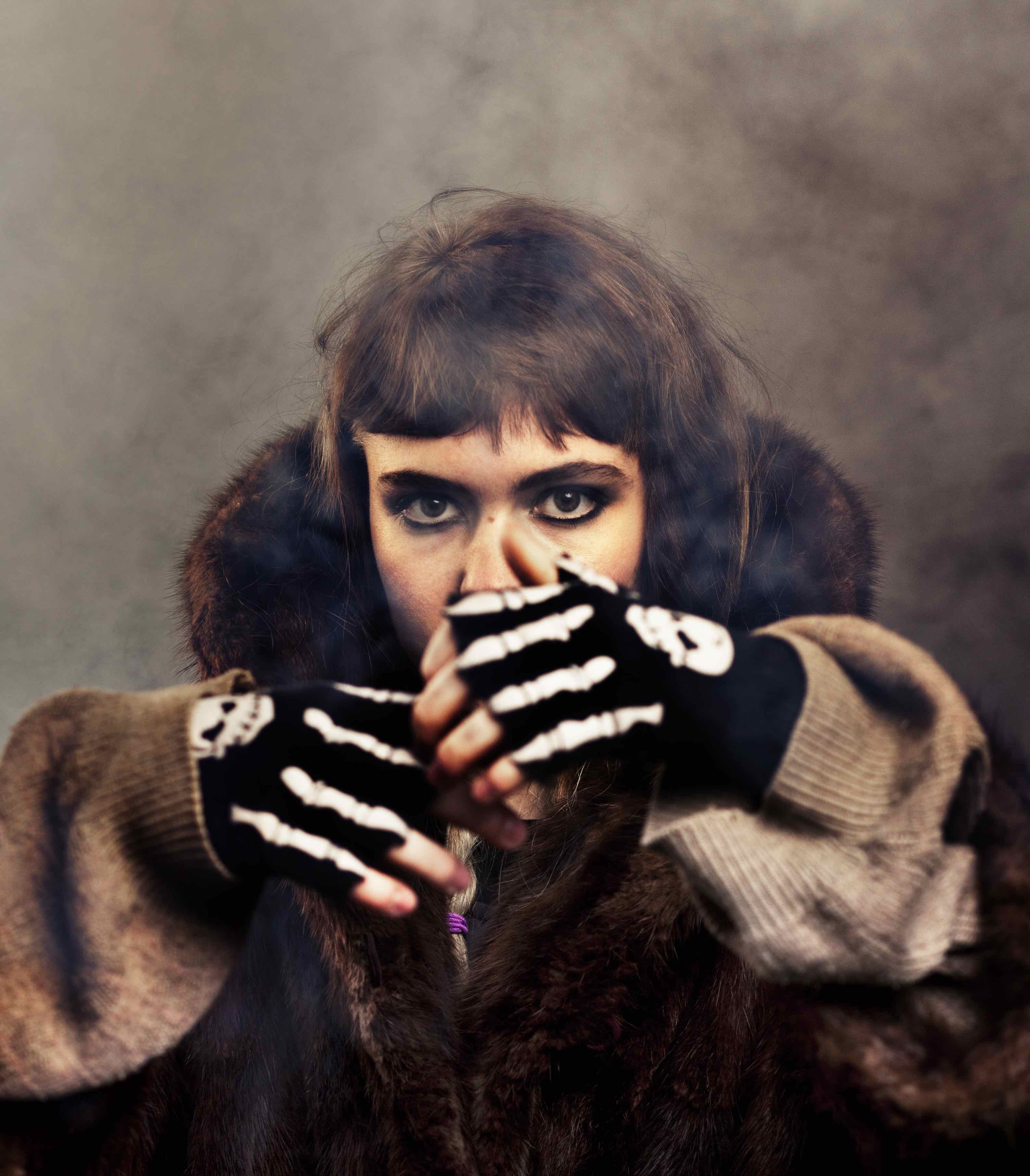
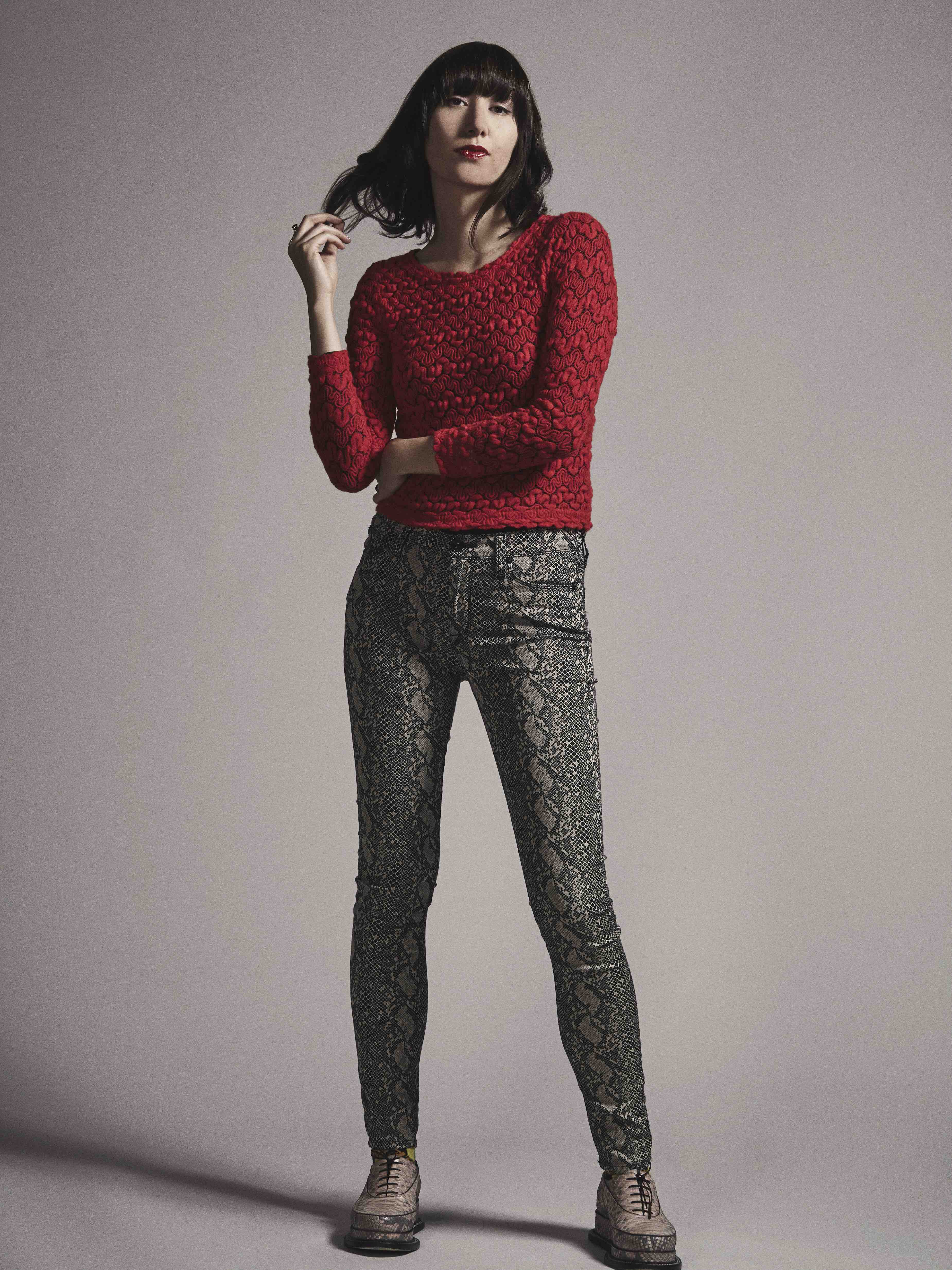
Alongside great music writing, the magazine has become notable for its unique and eye-catching photography, which is celebrated at 10 Years of Loud And Quiet: A photography exhibition at Oslo in Hackney.
Featured photographers include Andrew Kendall, Phil Sharp, Sonny McCartney, Owen Richards, Nathanael Turner and Gem Harris.
Huck caught up with Stubbs to talk about the magazine’s origins and what makes its photography so distinctive.
What first motivated you to start a music zine ten years ago?
I’d left university and romanticised being a music journalist, but it turned out that when emailing the existing titles at the time for a job, they received hundreds a day like that, so I figured it’d be easier to start my own fanzine.
I’m a very impatient person, really, but it worked in my favour because, actually, the magazines I’d started to contact for a job weren’t ones that I particularly loved. Really, I needed to start my own fanzine to make sure that I could write about what I wanted, how I wanted.
At the time if felt like the music magazines out there (and there really weren’t many) were featuring the same bunch of bands, and I wanted to do something that discovered new music, and presented it in a way that was then reserved for established acts. I wanted to publish in depth interviews with the bands and artists that would value it more than, say, Oasis.
What sort of zines and photographers did you take influence from when you started out?
I’ve always worked with my head down a little bit, on that front. The early concept for Loud And Quiet, though, was kind of inspired stylistically by high-end fashion magazines (from Dazed and i-D to all those ones you only ever seem to see once, but cost £15), crossed with ‘in depth’ writing. It certainly took a while to get each of those elements right, but that was the idea – a music magazine that was designed in a very sleek way, with great photo shoots. There’s a bit of a myth that any music resembling rock’n’roll or whatever you want to call it has to be presented in grungy or amateurish way in order for it to be considered authentic, and I wanted to try to prove that wrong a little bit.
How do you feel the landscape of independent music publishing has changed since Loud And Quiet started? How has the magazine itself changed?
There’s definitely more of it around now, which is great. A large reason for starting Loud And Quiet was because there weren’t any ‘alternative’ or ‘underground’ magazines around at the time. Back then there really was just us, The Stool Pigeon, Fact (before it became a site) and Artrocker. There are a few more today, which has changed things a little. I mean, there was a time when we could feature absolutely anything we wanted and be pretty certain that nobody else was going to bother covering it, but now you do need to bear in mind a little if you’re featuring a band or artist who is going to be all over the place.
I’ve always wanted Loud And Quiet to feature things that aren’t around too much elsewhere, and that’s definitely getting harder, not least because now there are a lot of good, big websites that are going after the same kind of things too, and broadsheets have become really switched on to new music, largely due to the fact that popular music is now ultimately free and everyone has an interest in it like they never did before.
Has the internet been a tool you’ve utilised in equal measure to the print edition?
It’s definitely been a useful tool, although we’ve definitely not utilised in equal measure to the print edition. That’s something that’s going to change as we’ve just employed a web director, who’s a very close friend of mine and knows far more about that kind of thing than I do (he’s leaving his job as the editor of NME.com to whip us into shape). As a man who’s always loved physical magazines, I must admit that until now I’ve been very careful not to harm the appeal of picking up our issues by limiting our web presence, and what does and doesn’t go up online.
The Internet is just so ENDLESS isn’t it? What I like about producing a magazine is that you have very real deadlines and limitations, and once it’s done, it’s done. That said, Twitter is a gift for promoting something you’re doing in the ‘real world’, and our site gets good traffic from people viewing old issues, current news and videos, and from people trying to track down their nearest stockist of the paper.
What makes the photography in the magazine so unique?
That’s all down to the photographers, and then our Art Director Lee, who knows exactly how to present them. If I can take any credit whatsoever, it’s only in that I’m not one for setting strict briefs, or much of a brief at all. All of the photographers that contribute to the magazine are very good at what they do, and I’ve always felt it best to let them get on with that and shoot how they want. They have carte blanche really, and I guess what that’s meant over time is that a style has emerged, and now people get in touch to shoot for us if they think what they do is a good fit, rather than if they think they could change the way they shoot to fit in with what we’re after.
How did you choose the photographs featured in the exhibition?
That was really tough. There were some that I’ve always had in mind for this (we were first going to put on an exhibition two years ago), and others I was reminded how good they were when looking through all of our back issues. We wanted to choose a mix of older stuff we shot early on – bands that went on to do great things, like The xx and Metronomy – and some of the special shoots that we never dreamed of doing, like David Lynch in his home in LA, and GOAT’s only photo shoot.
What are some of your favourite photographs featured in the exhibition?
I’m guessing I’m not allowed to say all of them. It is really hard to answer that, but intuitively, one of my favourite covers we did was a shot of Erol Alkan on Old Street roundabout in 2010. He’s hardly in the image (shot by Phil Sharp) and it just really suited Erol’s persona and his whole mythical thing at the time. It’s a great shot and was always going in there.
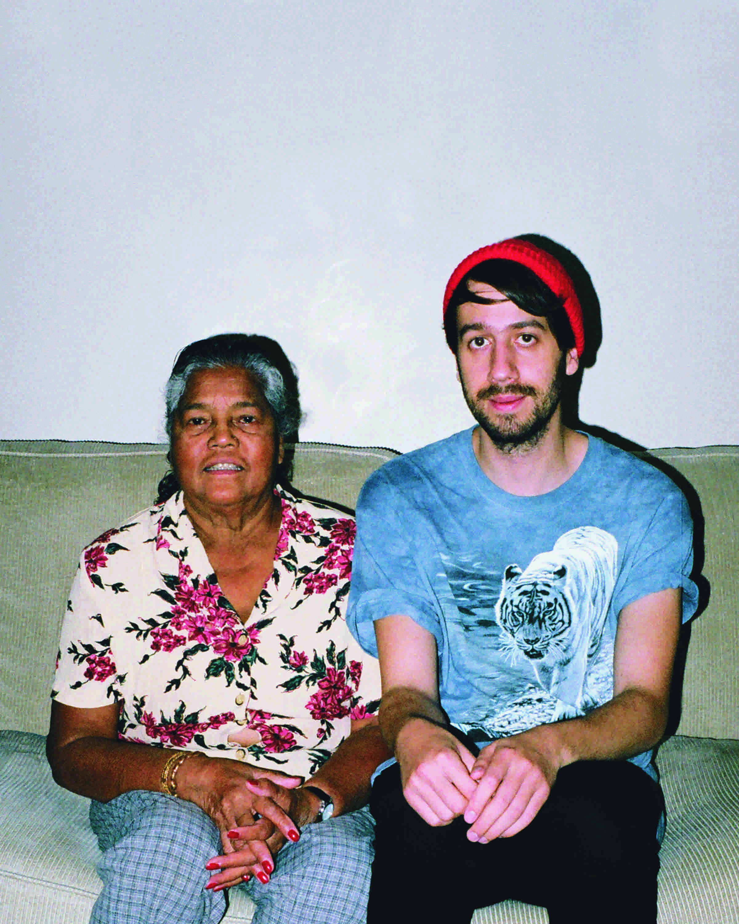
Around that time, Tom Cockram shot Telepathe for a cover too – the two of them looking down on this mottled backdrop like the ones you’d stand in front of for a primary school photo. I love that one. A real crowd pleaser always seems to be Gabriel Green’s shot of Gold Panda sat next to his nan in her house, but Gabriel’s shot of These New Puritans is really great too. I’ve always like it (in this eccentric boutique hotel in Kensington) but realised just how good it is when we got the print back for the exhibition. It’s probably the image that – colour wise – has printed the best of all.
How do you see the next ten years panning out for Loud And Quiet?
It’ll probably be my undoing, but I’ve finally stopped torturing myself that it’s all going to end tomorrow. Of course, that’s as true as it’s ever been, but that fear haunted me for so long in doing that that I had to let it go. I’ve always thought, ‘Oh god, what if it all goes to shit after this issue?’, and here we are after 10 years. So I’ve decided to try to enjoy it a bit more, because while that fear has motivated me to keep going, it’s a pretty stressful way to live your life.
I hope we’ll still be here, and one of the reasons that we are at the moment is because each year Loud And Quiet has grown slowly and steadily. It’s always felt worthwhile to me, so when people ask if I ever thought I’d do it for 10 years, the answer is probably yes, in as much as I never thought to stop doing it.
10 Years of Loud And Quiet: A photography exhibition is at Oslo, Hackney until November 13.
Latest on Huck

Clubbing is good for your health, according to neuroscientists
We Become One — A new documentary explores the positive effects that dance music and shared musical experiences can have on the human brain.
Written by: Zahra Onsori
In England’s rural north, skateboarding is femme
Zine scene — A new project from visual artist Juliet Klottrup, ‘Skate Like a Lass’, spotlights the FLINTA+ collectives who are redefining what it means to be a skater.
Written by: Zahra Onsori

Donald Trump says that “everything is computer” – does he have a point?
Huck’s March dispatch — As AI creeps increasingly into our daily lives and our attention spans are lost to social media content, newsletter columnist Emma Garland unpicks the US President’s eyebrow-raising turn of phrase at a White House car show.
Written by: Emma Garland

How the ’70s radicalised the landscape of photography
The ’70s Lens — Half a century ago, visionary photographers including Nan Goldin, Joel Meyerowitz and Larry Sultan pushed the envelope of what was possible in image-making, blurring the boundaries between high and low art. A new exhibition revisits the era.
Written by: Miss Rosen

The inner-city riding club serving Newcastle’s youth
Stepney Western — Harry Lawson’s new experimental documentary sets up a Western film in the English North East, by focusing on a stables that also functions as a charity for disadvantaged young people.
Written by: Isaac Muk

The British intimacy of ‘the afters’
Not Going Home — In 1998, photographer Mischa Haller travelled to nightclubs just as their doors were shutting and dancers streamed out onto the streets, capturing the country’s partying youth in the early morning haze.
Written by: Ella Glossop
